Signs and stickers#
Signage does two jobs at once. Outward, it announces that the neighbourhood is organised and responds fast — which is deterrence enough, with no patrol needed. Inward, it keeps the phone numbers that matter in front of everyone and marks the homes and spaces that belong to the network.
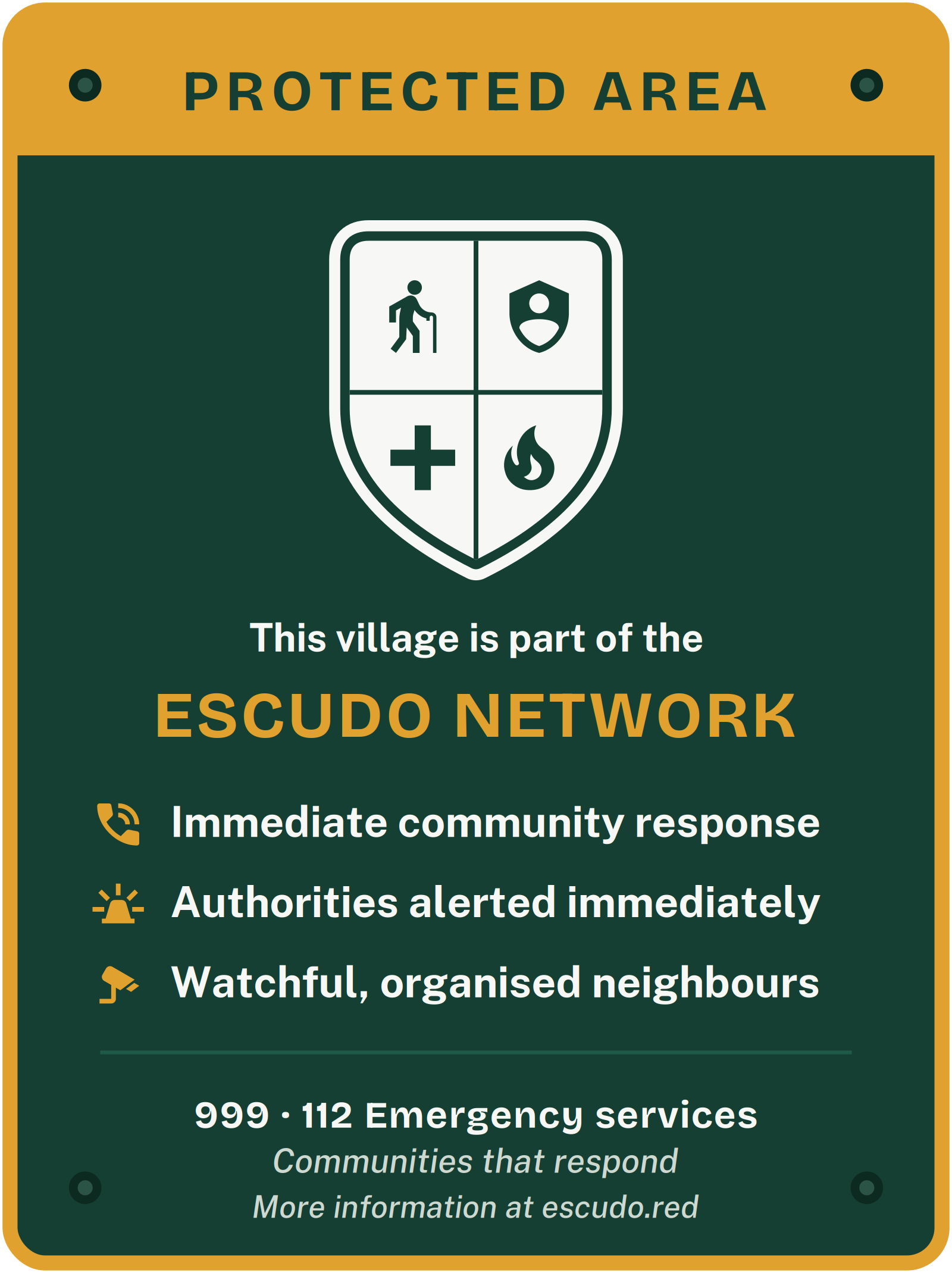
The whole message fits in a few words — immediate community response · authorities alerted immediately · watchful, organised neighbours — with the emergency numbers always visible. People are never named or singled out: the sign speaks about the community, not about suspects.
The artwork exists in two sets. The Spanish set carries 062 Guardia Civil · 112 Emergencias; the English set shown here is generic, carrying 999 · 112. Neither is universal: whichever you start from, put your own country’s emergency numbers on the sign before printing.
There are three pieces, designed for three different places.
The sticker#
Small, discreet, for indoors or glass. It goes on the window or door of a member household, on a letterbox or on a bin. It marks a home as part of the Red Escudo and keeps the phone numbers within reach of whoever lives or calls there.


The plaque#
Rigid and made for outdoors, to last years in the open. It gets screwed to a wall, a corner or a lamppost, at eye level. This is the network’s everyday presence: anyone walking down the street sees there’s a Red Escudo here.




The entrance sign#
The big piece, road-sign format, for the approaches to the village — next to the place-name sign or the noticeboard. It’s the first thing anyone arriving sees: you’re entering a village that belongs to the Red Escudo. Imposing, but never police-like: it communicates organisation, not threat.


Producing the signs#
- Formats. The SVG is the vector original: it scales to any size without losing sharpness and is what to take to a printer or sign-maker. The high-resolution PNG works for proofs, screens or home printing.
- Materials. For outdoors, the plaque and the sign work well in dibond (aluminium) or rigid PVC; the sticker, in weatherproof vinyl. Any local print shop can produce them from the SVG.
- Customisation. Before printing, adjust the village name and your Red Escudo’s contact numbers if they differ from the ones in the design.
Production note. These are working designs, set in the brand’s own Bricolage Grotesque and Public Sans. Because the SVGs reference those fonts by name, ask your print shop to confirm they have them — or request a text-as-paths version, which needs no fonts installed.